I'll begin by mentioning that the type font is 16 point EB Garamond which is similar to Baskerville. I would prefer Baskerville, but my hosting service does not provide that option. Why my preference for Baskerville you may ask? Baskerville is a serif transitional typeface designed by John Baskerville of Birmingham England in the eighteenth century. Transitional refers to the fact that its creation falls between the older typefaces of Caslon and the more modern typefaces of Bodoni. Having been a printer, I always appreciate a book which describes the typefaces used and the stock upon which it is printed.
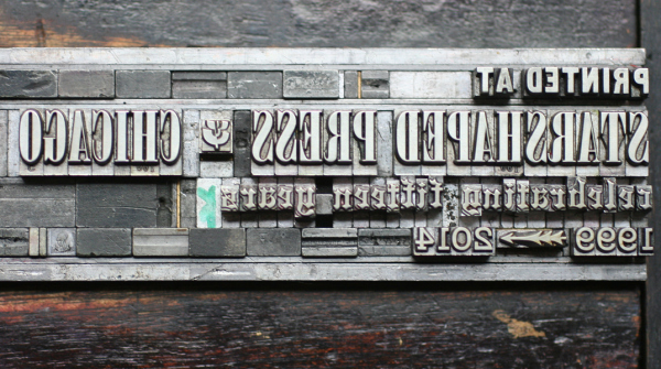
When I was pursuing my graphic arts studies, I had the opportunity to take a a class in letter press printing. Even though my concentration was in layout and design, I was required to take two printing classes. Most commercial printing these days is photo offset printing or some even newer technology. Letter press printing is the more historic method where paper is placed on a platen either by hand or mechanically, and the paper is then brought into contact with a chase filled with type upon which ink has been applied by hand or by a series of rollers. We had three presses in our lab and I always used the Heidelberg which is the Rolls Royce of letter press printing presses. I loved operating that press even though I am not particularly a mechanical person. The scent of the ink, the sound of the paper swishing into place, and the smack of the type striking the paper and being delivered onto the paper table was intoxicating. The Heidelberg ran like the proverbial Swiss watch and even sounded somewhat like a ticking watch, a sound which has all but disappeared in the digital age. We also had a Ludlow Typograph which was a smaller alternative to a Linotype machine. The Ludlow is a hot metal device that allows you to cast slugs of type which when cooled are set in a chase (in mirror image) in the format that you wish your content to appear on paper. We also had access to a few typefaces in moveable type.
Letterpress printing seemed to me to be more of an art form in that you have to insure that the right amount of ink is applied to the type and insure that the type contacts the paper with just a kiss of an impression. Too light the contact and you will have ghosting and too heavy, embossing. Part of the allure of operating that Heidelberg was the challenge of arriving at the exact settings that produced the most pleasing impression. Another part of the allure is that fact that I felt more connected to the history of the printed word and all of the book artists who preceded me.

| 

|
 RSS Feed